Project Chelsea Mood Board: Marrying Feeling and Function
What makes a house a home? It’s different for everyone. One of the most rewarding parts of my job is working with clients to uncover the special things to create a space that says “welcome home” to them every time they walk through the door.
It all starts with a conversation. Does the client crave clean white walls and clear surfaces, or is it bold color that makes their heart sing? During the onsite consultation, I talk to clients about their wants and needs—the things they desire in their dream home. After the conversation, I develop a mood board. Using a range of sources, from Pinterest to furniture catalogues, to paint chips, I look for elements that evoke a similar vibe creating a visual story about what their space can become. For more of our inspiration for this space check out the Pinterest board.
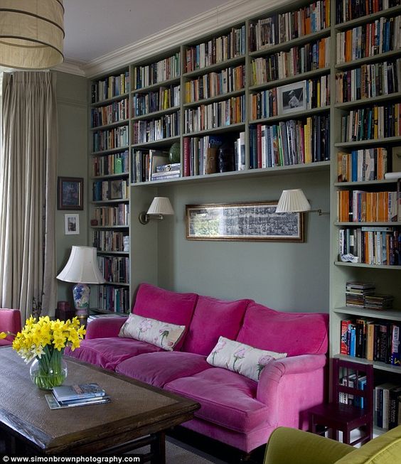
This client asked for more exposed storage to display all of her special treasures including books, family photos, and tchotchkes acquired on travels. Every every item has a story behind it and each story is a precious memory to be experienced every day as they move through their home. A design that worked to both store and showcase these items was a top priority for this client.
Functionality—like feeling—is one of the pillars of our work at DBK. My philosophy is that your home is more than a roof over your head, it’s a tool to make your life better. I work to create beautiful spaces that also work for the client’s lifestyle.
This client expressed a range of needs for every room: a place to set mail and keys when entering the door, a mirror for a last look before leaving, a spot to sit in while putting shoes on or taking them off after a long day, dining and work spaces, as well as concealing a built-in air conditioning unit.
Marrying the feeling and function the client wanted, we developed the following mood board:
This client—who I’ve worked with on other projects—is not afraid of color. She is a passionate art collector and loves to find ways to highlight special pieces in her collection. She had a work of art in the kitchen that was already centered and highlighted simply by it's placement. We used this piece to curate the color scheme for both the multi-purpose dining/entry space and the kitchen. We pulled some playful elements into the backsplash and shelving to tie these adjoining rooms together.
We took advantage of high ceilings and an interesting nook in the architecture, carved out a built-in bookshelf to cover the air conditioning unit and extend to the ceiling with various sized cubbies to display everything. We took it up a notch by extending it around the corner only at ceiling height create a cozy seating area just inside the front door.
All of these elements and details, combined with the colors, helped us to show the client how the rooms could be updated to create the space she wanted.
The mood board is the first step towards creating dream spaces. This client opted to hire us to orchestrate the all the moving parts—from managing contractors, to selecting furniture and fixtures, to staging rooms—to bring the vision to life. Other clients opt to take the DIY route after seeing the mood board. Whether you are looking for us to handle every aspect of the process or simply need us to help you define your vision, I’d love to help you.


