Project Hamilton Park Revealed: Plants, Styled Shelves, His & Hers Work Spaces, and More
Our first apartment package client was looking to create the special feeling of home and functional work spaces for two.
Last week I gave you a glimpse of our first completed Apartment Package project when I wrote about creating a dedicated, curated work space that makes you feel inspired, energized, and productive. Now, It’s time to share the rest of the story behind this cozy apartment in the Hamilton Park neighborhood of Jersey City and the newlyweds who live there.
In addition to the “his and hers” work spaces featured in our New Year’s Resolutions for Your Home post, the client wanted to create the same feeling in this space that she had in the home she grew up in. Her family home had an eclectic collection of thrift store finds she and her mother collected over the years. Her current apartment was missing the character that says “welcome home” to her. She craved the color of her childhood home, wanted plants requiring only minimal care, and they wanted more seating in their living room to entertain friends and family.
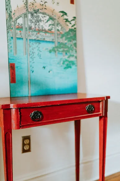
This unique red table was one of the thrift items the client had in her childhood home. It’s place in their Hamilton Park apartment says “welcome home” every time she walks through the door.
Sustainability—and affordability—are key components of our apartment package. When we walk through the client’s apartment our objective is to work with you to identify what’s not working for you and why. Then we give you as many options as possible to resolve your issues using the furniture and accessories you already have. The goal is to give you the feeling and function you want, without spending all of your money to re-do your space. We tweak your furniture placement, offer advice to maximize your space, give you tips on where to hang artwork, style your shelves (if you have them) and then suggest purchases to round out the look you want and make your place work better for your needs.
After receiving a vision board and recommendations from us, Apartment Package clients have the option of taking our ideas and handling the rest of the project on their own or they can engage us in a few “a la carte” hours to implement the vision. This couple opted for the latter. We worked them them to move the furniture, style the shelves, source the area rug and brass/marble “C” table, along with some accessory shopping—including purchasing the divine blue pillows for the couch.
I was thrilled to find these pillows. They are perfect—straight out of the vision board for this space.
To declutter and organize the space, we carved out a plan to style the shelves. There is lots going on here. Proof that that the maxim “a place for everything and everything in its place” doesn’t mean you must force yourself to be a minimalist. If you love seeing your favorite photos, or books, or items you’ve picked up on your travels, your shelves are a perfect place to store and display these items.
Having a place for everything makes your home function better. It’s easier to have a tidy, clutter free home because it only takes a few minutes to put everything back where it belongs.
Shelf Style: photos, books, a basket and a bar.
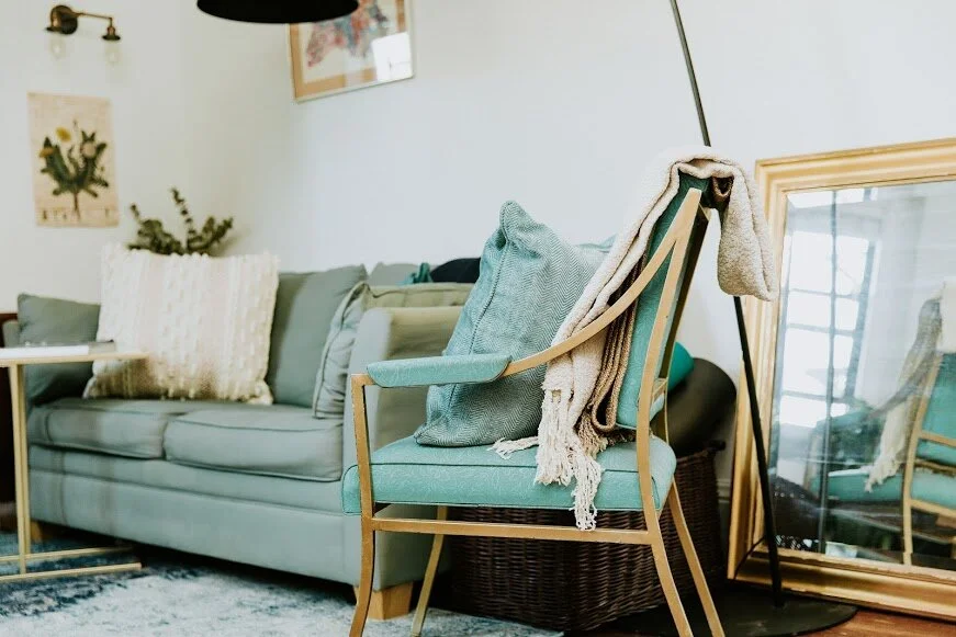
Before the redo, the clients had only a small sofa in their main living area. To get the seating they wanted to entertain friends, the client thrifted two blue/green chairs that matched perfectly with the color scheme we set in the vision board.
It doesn’t need to be “new” to be beautiful. This thrifted chair is the perfect color and fit for this space.
Every project—every client—has a special story. The office spaces in this project are one of my favorites from this one. The husband was very skeptical of the process and of working with a designer but he agreed to give it a try because he knew their space wasn’t working for them. His desk was the big bone of contention. It was facing the built-in bookcases. I suggested repositioning it to create an open feeling and give his workspace a view to the rest of their home and the windows beyond. He was resistant to the idea (going so far as to say he would change it back after we were done). He was so thrilled with the result he texted his wife to say “I am seriously obsessed sitting here looking at how awesome it is”. Yes, he’s keeping the desk exactly where we put it.
His space features a compact desk, easy access to his guitars, and views to the rest of the home.
We put her workspace in front of the window and accented it with low maintenance plants she wanted. When she’s not working, the folding chair slides into a space at the end of the desk, making the room feel open and airy.
Her space is bright and cheery with lots of light and greenery.
I’m thrilled these clients love their updated home. One of the most rewarding parts of my job is working with people to create beautiful spaces that also meet their needs.


