Simply Striped Updated Kitchen
A picture is worth a thousand words
This kitchen is so beautiful I am going to let the photos do the talking—or at least most of the talking—in this post.
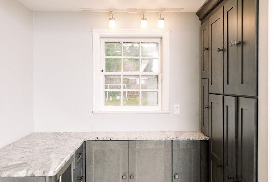
Coming up with a new layout for this kitchen presented unique challenges. The biggest was the space itself. From a top view, it was shaped like a reverse "L". The little tab on the “L” housed the sink and dishwasher in a tight alcove, and the stove and refrigerator claimed opposite remaining corners of the space. The layout felt discombobulated and it wasn’t working for the client who wanted the space to flow better and function better for entertaining.
This client was willing to push the design envelope. When I pitched a striped backsplash—inspired by Amy Beth Cupp Design's penny tile striped kitchen floor—she was all in. The gray and white are subtle and feel more classic than bold. It gives this space an unmatched “wow” factor. The penny tile is a budget friendly option too.
We pulled the sink and dishwasher into the main area of the kitchen. We put the wine and beverage fridge into the “L”. It was a perfect spot for this detail which makes entertaining guests easy. (Who doesn’t want a fully stocked wine fridge in their home?) Then we designed the the working triangle to flow and function to meet our client’s needs.
This client knew exactly what she wanted, and what she didn’t when it came to her storage space and her budget. She didn’t want open shelving or lots of uppers, for both budget reasons and because of the open feel she wanted. In some areas we built the cabinets out from floor to ceiling, while in others we took them from countertop to ceiling. We also left the walls blank—giving the tile it’s bold impact.


