Before & After: DBK Project AND Kitchen
It’s been a while since we’ve shared a good old before and after post, so I thought I’d use this holiday weekend Monday to share a little photo inspiration of the Kitchen at DBK Project AND, and how it was transformed.
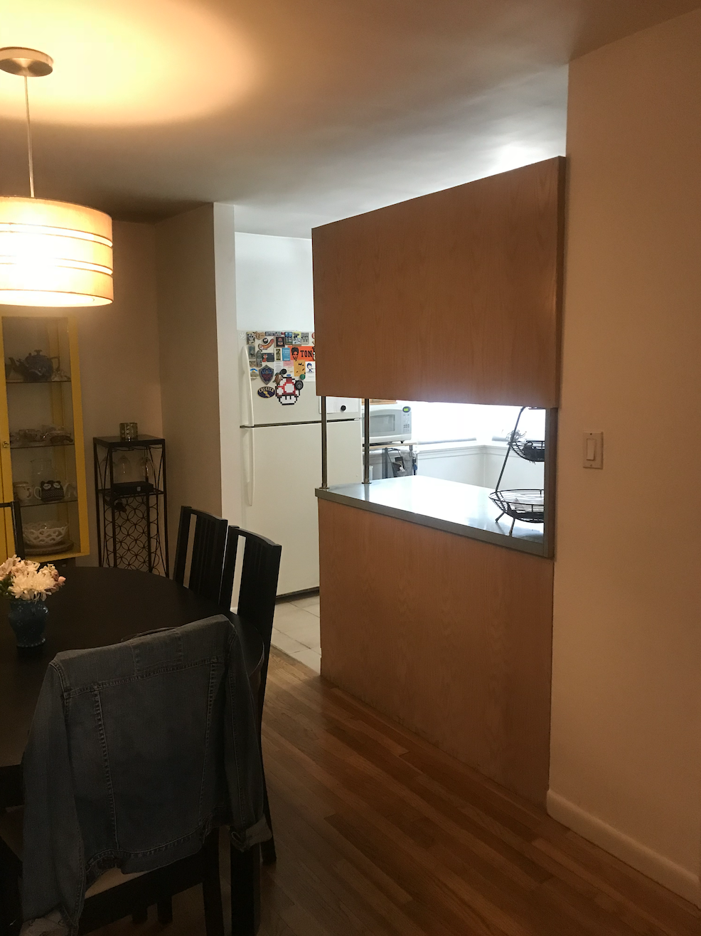
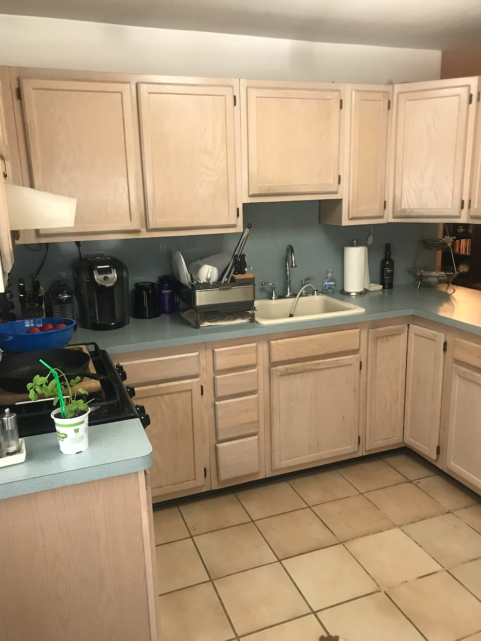
This kitchen was previously closed in and poorly arranged. The layout didn’t make a lot of sense, there was wasted space and there were unnecessary walls blocking the flow between the rooms.
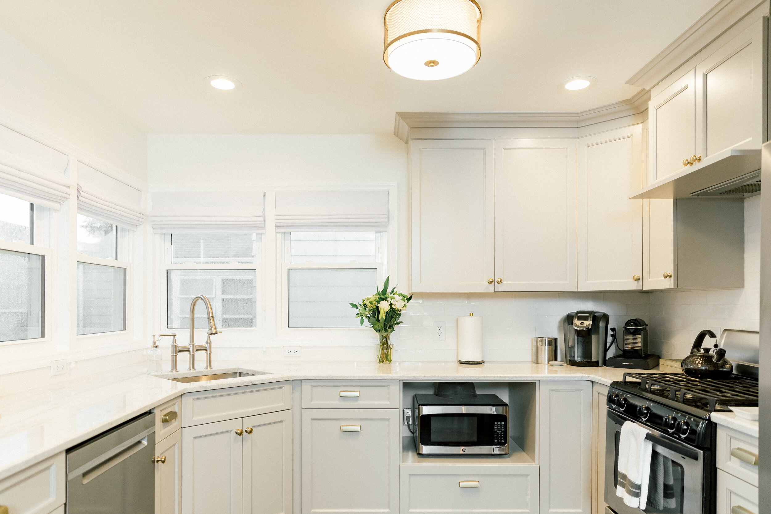
The best part of the kitchen, was all of the natural light that was streaming in from the windows, but beneath the windows, there was no workspace or storage, just an empty corner. We took care of that by lifting up the windows, pulling in the sink to the corner location to highlight that space and set the client up to do cleanup with a view.
We pulled the refrigerator and range to this wall, to anchor the space and tuck the largest appliance out of the direct line of site, to help make the kitchen look bigger and let the other details, like the sink and open shelf, be more of the focal point; while letting all that natural light stream through unobstructed.
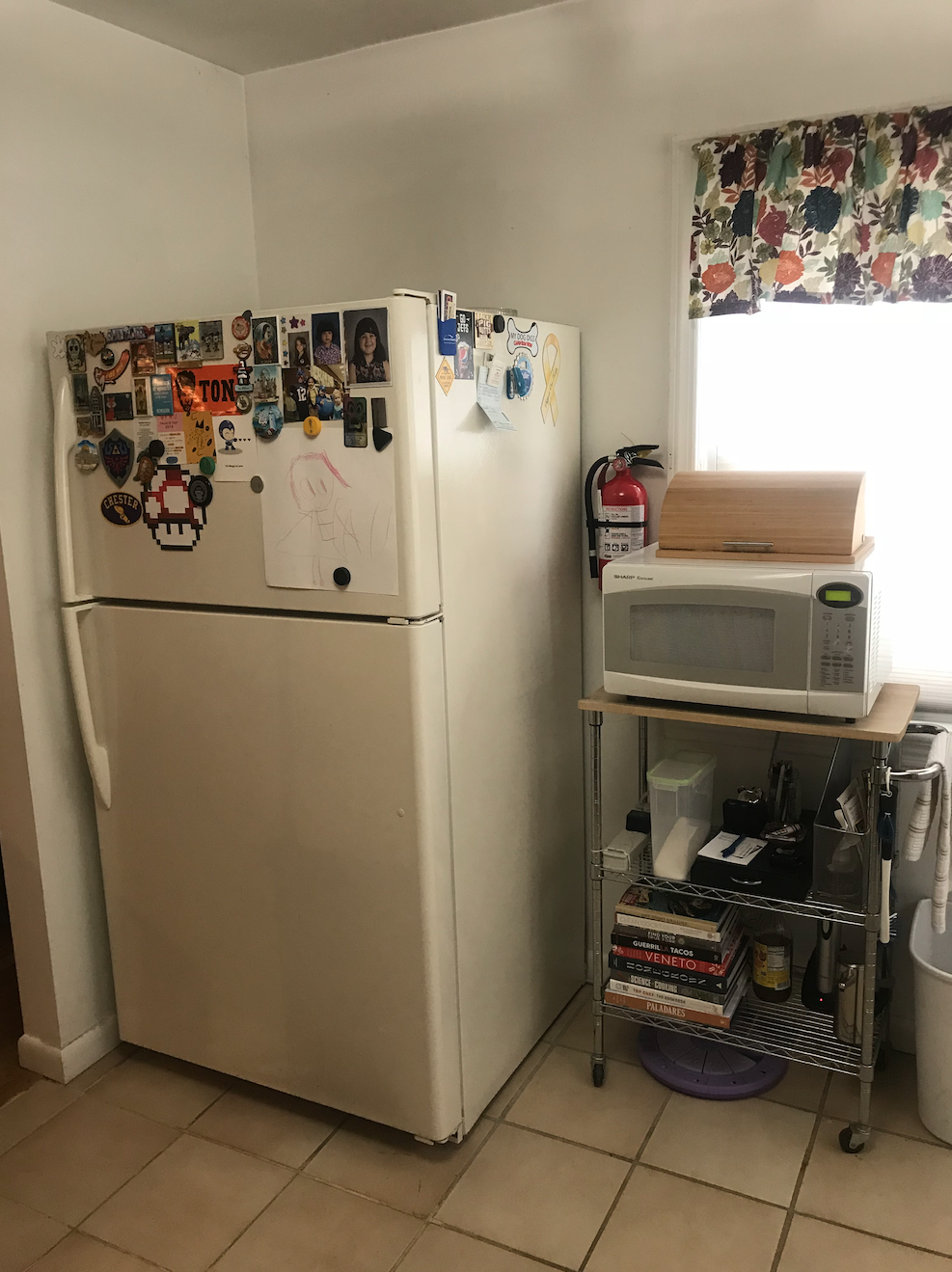
Here is where the refrigerator used to be, up against a wall, sort of free floating. So by pulling it to the other side, we not only made it feel like part of the kitchen and built in, but we were able to remove the wall, extend our cabinets and workspace just a hair and give a great focal point when you first walk into the space.
Details like a warm taupey cabinetry color, brass hardware, and a backsplash with a handmade feel all help to warm up this space and make it feel special.
Thank you for checking out this project and these before and afters! We hope you like what you see. To stay in touch and see more updates, you can join our mailing list and we will keep you in the know!


