Project Chelsea Revealed: Bold Color, Feeling, and Function
In October, I shared the mood board for Project Chelsea. The mood board helps us show the client how all the elements they are looking for—color, function, feeling—can be combined to create the space they want. Having set the stage, I’m thrilled to share the details and photos of the finished space.
The impetus for this project was an unfortunate turn of events. Another tenant in the building had a leak in her kitchen while all of the occupants of the three units were on vacation. This led to the drywall being damaged in two rooms of my clients home Although she could have simply replaced the drywall and salvaged the rest of the items, she decided to use this as an opportunity to renovate her home.
We came onsite after all of the water damage had been removed and they were prepping for sheetrock, which provided a great blank slate and plenty of advantage to properly plan our next steps. It allowed us to remove the header over what was a doorway between the kitchen and dining room and create an opening all the way up to the ceiling create better flow and better connect the rooms.
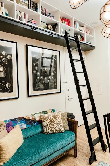
This client loves to read, host friends, is often on the move, and is a collector of all things. To meet her desire for more exposed storage to display all of her special treasures—books, family photos, and tchotchkes acquired on travels—we carved out additional open storage on the vertical space, while using the horizontal floor space to include additional seating, and functional pieces to help her move effortlessly through her space.
This client also shares our core value of sustainability. She loves reusing materials whenever possible, and also has a passion for travel. With these two things in mind, we opted to keep her existing dining set, but painted the pieces black to pull in a strong Asian feel, and then incorporated other Asian details in the space.
We frequently work with second hand furniture that has either been thrifted or purchased online through retailers like Chairish, which can be great—unless someone else swoops in and buys the piece you both loved the most just before you get approval to purchase. Which is exactly what to us, and for a hot second, it felt disastrous. But we powered through and ended up sourcing a piece that worked just as well (if not better) in size. Then we took a day to mix up the perfect color of chalk paint and refresh it to work better for the space.
Don't you love the look of the plummy-purple Asian chest in this space? It worked much better than the piece's original red color and we had fun transforming it!
The other big challenge in the space was getting that gorgeous ladder to work. Nobody wanted to be responsible for making sure it was properly supported in the wall, but our carpenter came through to build a support ledge for the ladder rail to be installed on, and for the built-ins to flank. It turned out beautifully, not to mention the ladder is a dream! (Who hasn't dreamed of having a rolling ladder in their space at least once in their life?)
The client had a work of art in the kitchen that was already centered and highlighted simply by it's placement. We used this piece to curate the color scheme for both the multi-purpose dining/entry space and the kitchen. We pulled some playful elements into the backsplash and shelving to tie these adjoining rooms together.The two rooms now flow together better than before.
Once all of the main elements were in place, we spent quite a bit of time curating the client’s collections on the shelves to create a great visual that's not overwhelming. The details, after all, make the space.
See more photos of this beautiful space—the perfect marriage of feeling and function—in the gallery on our website.


